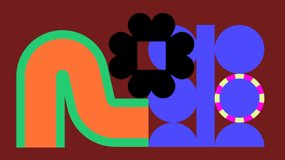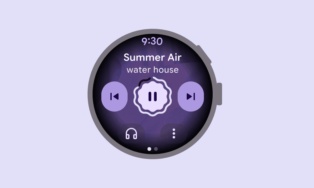
Design systems became popular by promising consistency. Shared components, spacing and tokens helped large teams avoid rebuilding the same interface repeatedly. Google’s Material 3 Expressive pushes that idea into more subjective territory. Its updated system emphasises vibrant colour, flexible typography, contrasting shapes and motion physics intended to make digital products feel more engaging and emotionally legible.
The shift reflects a familiar tension. Mature design systems can become efficient but anonymous. Products assembled from the same primitives may be usable while losing a sense of character. Expression is an attempt to restore differentiation without giving up the operational advantages of a shared system.
Expression becomes structured
Material’s approach is notable because it does not frame emotion as decoration added after the interface works. Motion, shape and emphasis are represented as reusable rules. That lets a team decide how energetic, calm or direct an interaction should feel and then carry that decision across components. The system becomes a vocabulary rather than a fixed visual kit.
Tokens are particularly useful here. When motion characteristics and visual roles are named, designers and developers can discuss intent without copying isolated values. A transition can be adjusted across the product, tested with reduced-motion settings and implemented consistently on different screen sizes.
More personality creates more responsibility
Expressive interfaces can improve hierarchy and recognition, but they can also become exhausting. Strong contrast, animated transitions and irregular shapes compete for attention. If every control performs, nothing feels important. Teams need rules for quiet surfaces as much as rules for expressive moments.
Accessibility also places boundaries on expression. Motion must respect user preferences, typography must remain readable, and colour cannot carry meaning alone. A design system should make these constraints automatic where possible. Creativity is not reduced by a reliable floor; it gains space because teams do not have to renegotiate basic usability on every screen.
Adaptive products need adaptive systems
The updated Material guidance also responds to a device landscape that no longer fits one rectangular phone. Foldables, tablets, watches and large screens require components that change composition without losing identity. An expressive system has to preserve its rhythm and hierarchy even when the layout transforms.
This is where a system earns its name. A static library supplies assets. A real system explains how decisions respond to context. Teams evaluating Material 3 Expressive should pay less attention to whether they like the sample screens and more to whether its underlying rules help them make coherent decisions across states and devices.
A design system can have a point of view
Material 3 Expressive argues that consistency and personality are not opposites. The practical challenge is governance: deciding which expressive options belong to the brand, when they clarify an action and when restraint serves the user better. The most successful adoption will not use every new capability. It will select a recognisable range and apply it deliberately. Expression works when it communicates, not when it merely proves that the system can move.